Wednesday, April 20, 2011

Unclassed Choropleth maps

http://lewis.sppsr.ucla.edu/special/metroamerica/ladiversity/Newr00.jpg
Unclassed choropleth are maps that use shadings techniques propotional to the data values so that these choropleth maps do not have to classify the data. This map shows different racial/ ethnic diversity in Los Ageles county in Califonia City by the use of shaddings.

Standartdized Choropleth map

http://upload.wikimedia.org/wikipedia/commons/thumb/7/78/USA_states_population_density_map.PNG/800pxhttp://upload.wikimedia.org/wikipedia/commons/thumb/7/78/USA_states_population_density_map.PNG/800px-USA_states_population_density_map.PNG
This maps are used to compare data distribution among different areas using certain standardized data such as ratios and rates. This is a Standartized map showing the 200 census population  density according to the states area in square miles.

Accumulative line graph or Lorenz Curve

http://www.tx.nrcs.usda.gov/technical/wrat/images/swat/weblinec.gif
Accumulative line graph are maps that shows graphical representation of the cumulative distribution of probability distribution. This Lorenz curve map shows sediment loard into lake Wado from 1990 to 1994 in tones measured every month.

Isopleths

https://blogger.googleusercontent.com/img/b/R29vZ2xl/AVvXsEhMml_lr71SwiJO_xaQZG1MpyjUoXbl2fLS0NHBqX8p_Wdb5V_RXFtPCjY9bi-7DMy-cxZHpYl3cZ1X8Ur-_ne2hqcZoBcOQFXE7XjRfCVcBnlPswsRjJ6FP_IFPz3qGjX1M01_YQ_1xNY/s1600-h/isopleth.gif
Isopleths are maps that consist of lines connecting places of equal value of distribution for a given theme, such as rainfall or temperaturer. This map greated by the Oregon limate service at Oregon state university,  shows rainfall from 1961 to 1990.
[isopleth.gif]

Isohyets

http://www.weather.gov.hk/informtc/prapiroon/prapiroon_rf.gif
This are maps that have lines joining points of equal precipitation on a map. This Isohyets map shows lines that are represented through contours.

Isopach Map

http://www.beg.utexas.edu/environqlty/co2seq/co2data/graphics/8arbuckle.jpg
Isopach are contours that connect points of equal thickness. This is a  Isopach map of Woodford Shale in Hunton Group in the anadanko basin of Oklahoma.

Wednesday, April 13, 2011

Univariate Choropleth maps

https://blogger.googleusercontent.com/img/b/R29vZ2xl/AVvXsEjSTJJwr8RPFYBUUr3Pch1OOxRMDJ89lIQWn8LrvLfg61Mu1VpbGaRPAdeHQrb-fYOHwiPo9NvLepE4oOv-HdpvPEhRaVnljKm8MOizCdN_yswPk86XwTGl4e6jyvpzHm6GJcQFRlqmGWNp/s400/univariate.gif
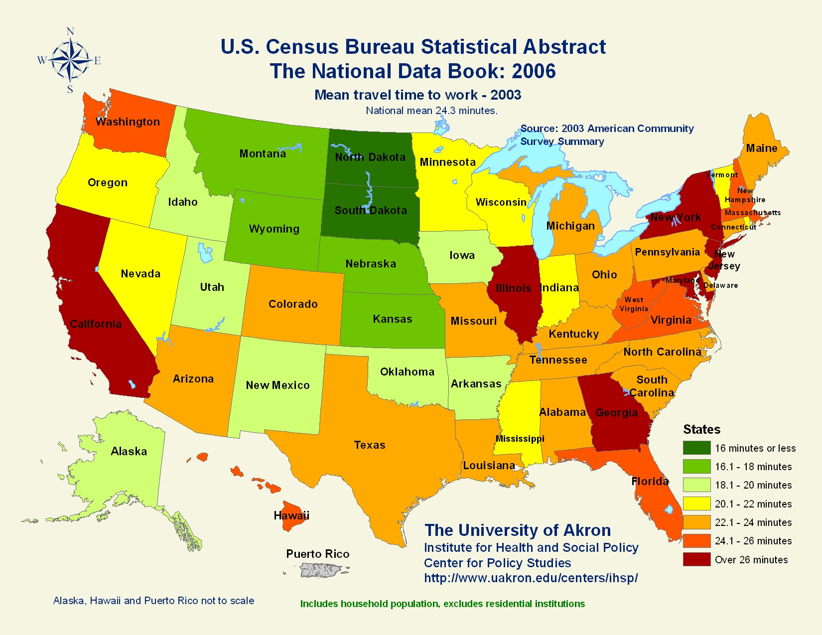
Univariate Choropleth shows only one set of data. This map shows median income of each states population as provided by U.S census Bureau.

Continuously Variable proportional circle map

http://geographyfieldwork.com/Choropleth2.gif

It is a proportional circle map which utilizes circles to create point data.This is a map that utilizes circles instead of dots to create point data, it is a map of Czech Republic and it's variables is written in czech.

DOQQ Map

http://www.dnr.sc.gov/GIS/images/doqq_ex2006.gif
DOQQ is an aerial photo that has been corrected for image displacement.
This map shows the aerial displacement of South Carolina counties in black and white aerials photograps.

Nominal area choropleth

https://courseware.e-education.psu.edu/courses/geog482/graphics/citationexample.jpg
This are maps that  are used to display nominal data. This is a nominal area choropleth that shows states in U.S with the highest percentage of minority group by use of different colors.

Stem and leaf plot

http://www.wmich.edu/cpmp/parentresource/images/c1u1sumgraph3.jpg
This stem and leaf plot is used to present quantitative data in a graphical format same as histogram to assist in visualizing the shape  of a distribution. This shows the test score that were displayed in the histogram, the first line scores of 10, 17, 19 and the second line is 21,21, 23, 24, 26, 27, and 28

Sunday, April 3, 2011

Parallel Coordinate Graph

http://bdtnp.lbl.gov/Fly-Net/content/bid/pcx/ParallelCoordinates/LineTraceHighlighting_3D.png

This are maps that different sets of information are can be graphed in the same plane, and on the same graph. The above Parrallel Coordinate, show sets of  genes, and cell sample in drosophila embryo, and the cell expression correspond with gene represented by series of parallel vertical axes according to AP cell position..

Scatterplot Map

http://www.masternewmedia.org/news/images/world_map_scatter_plot_350.jpg
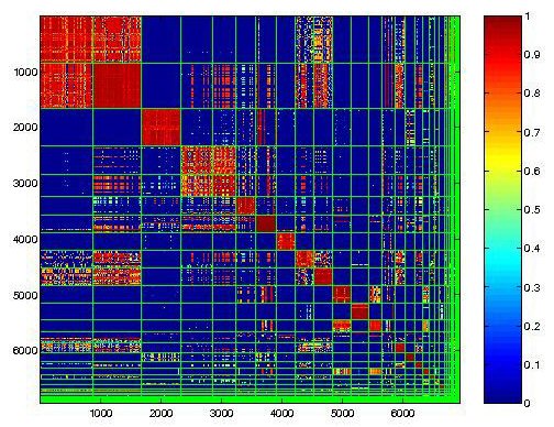
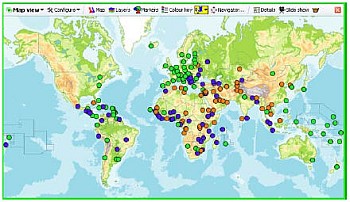
Scatterplot are useful map that shows the graphs for examining large data sets. This map shows scatterplot of U.N statistis on changes in forest cover over the period of 1990 through 2005.
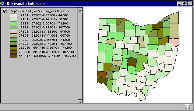
Unstandardized Choropleth Map

https://courseware.e-education.psu.edu/courses/geog482/graphics/citationexample.jpg
Unstandardized Choropleth are maps that utilizes aw numbers when displayed, and they are not averaged out . This map shows unstandartized  Choroplate of different minority group population  in United States.

Bivariate Choropleth Map

http://proceedings.esri.com/library/userconf/proc99/proceed/papers/pap171/p1716.jpg

Bivarate choropleth are maps that display two variables on a single map by combining two different setes of graphic symbols or colors. This Bivariate shows the population in a state using different colours to indicatehow spacially or dence the population i in an area.

Classed Choropleth Maps

https://blogger.googleusercontent.com/img/b/R29vZ2xl/AVvXsEgBVBrXbuAcDJjY7T-E9hciuDpazNe4pqmh1k7nJ6meEFT9kteqZ0E7TGCkTLJbY5PtynDP-DPLjN6tTNDzBWurEvOEZ2vx3l6GKcmNAsI7hXOEuVc6BPDdqeRR7qdN-4RfSsi8FK3W_qgA/s1600/classed+choro.jpg
[classed+choro.jpg]Classed Choropleth  determine the height and shading or color intensity of the bar for each map classed. This map shows spending overseas  residents in millions, each color stand for a group amount.

DRG Map

http://msdis.missouri.edu/data/drg/images/drg-index-map.jpg
DRG map shows the scaned image of gegraphical survey with the USGS. This is state of Missouri following list of 24k DRG quard numbers.

Isotachs Map

https://blogger.googleusercontent.com/img/b/R29vZ2xl/AVvXsEhSuiHomLeHJe6qqPWAc0qW4Xe2qbH5JHW_ruJSvQGd3mJsrLTnsnJcCuFqj8PRbu0YK_B7_Rb6IwFUPjbF53jUnTRaJ0eRJfPQVQZqRXOpQnhdW5n26cVl375_a1PaANumVKX-poMGGTf_/s320/isotach.jpg
Isotachs are map that shows a line on a weather map connecting point of equal wind speed.This Isotach map shows the counters of surface wind speed (kts) and streamlines on knots.

Black and White Aerial Photo

http://egsc.usgs.gov/isb/pubs/booklets/aerial/graphics/fig16.gif
Black and white Aerial map shows the grahic representation of  a place or objects that convey many of the physical properties using black and white color.This Image shows Golden Gate Bridge, San Francisco, Califonia, August 1993 black-and-white  National aerial photograph program.

Doppler Radar

http://radarimg.weatherbug.com/images/AWSRadars4/hawaii_radar/0/radar0.web.jpg?rnd=2-040320111500&rnd2=1301842933649
This are maps rada that uses  Doppler effect to measure velocity of a moving object.This Doppler Radar of Hawahii shows the weather preciptation in time at Walpahu.

Infrared Aerial Photo

Infrared Aerial Photos map shows photograps and other imagers of the earth taken from the air and from space which show a great deal about the planet's landforms, vegetation, and resources.This shows infrared Aerial photo of Onondago lake in Syracuse area of New York.
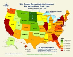
http://www.onlakepartners.org/gif/p1101d.gif

Saturday, April 2, 2011

Cartographic Animations Map

http://mapsofwar.com/index.html
Cartographic animations are maps that  shows graphic art that occurs in time. It help in visualizing a phenomenon that could not be apparent if the map were viewed individually. This map shows the way religion spread all over the world.

Statistical Map

http://mappery.com/maps/United-States-Travel-Time-to-Work-Statistical-Map.jpg
It is a special kind of map in which the variation in quality of a factor such as rainfall, population, or crops in a geographical area is indicated.This Statistical map show the U.S population census abstract in the national data book of 2006.book  

Propotional Circle Map

https://blogger.googleusercontent.com/img/b/R29vZ2xl/AVvXsEglNAhZHihXyWPM_iUEGNF43FRAuMNSgFdvJb_OJc2-CpRUMBkdHF36c5_70nr0MycPagRL7USLQ3l4PI2f-SmYrBFFW5I2X8Dg6wBzvtQt-QlBJf0nnHVvZqnShJLqyHO5vyRAEbU-ntFa/s400/circlecontpro.gif
This is a map that uses a different sizes of circles and pie chart to represent information in an area.This Proportional circle map shows 2006 Canada's subtotal provinces and territorial areas.

Choropleth Map

 Choropleth Maps show the areas shaded based on the predefined aerial maps.This is a map of Africa Choropleth showing the cross domestic product in  different countries in Africa, the thicker the green color the more domestic product are being supplied..bp.blogspot.com/.../s400/Africa_by_gdp.png

Dot Distribution Map

https://blogger.googleusercontent.com/img/b/R29vZ2xl/AVvXsEhRTb5WkTzacsdWR55Xo3DwWk2yTyesfzsAc6zvcaHdZZ5alYKsIyJl0R2gkug4yeSMtvHxONO82_BywJtBfJickCD_UueNh14U2H9AssI6yGmlpp_bJCMg5jZH4jwUuYDXcol2EUhE7_IV/s400/Dot+distribution.gif
Dot Distribution map shows representation of various quantitative data found within the boundaries of a certain area. This map represent United States population distribution by according to the states.

Propaganda maps

https://blogger.googleusercontent.com/img/b/R29vZ2xl/AVvXsEj4zob1Ga3QEXEoIQxIdKRd41wY5Xd_-HvXoLimB5oqWJaTi5mkQJ4Qt-AywcGV_i8oo18aQIpaHDbg4BQtamNkWEf4KB3whhP1z3HHvMc4RfLPfUB_glI6CdNlq4_CWt7Slw59VZXPsck/s1600/japan+propaganda+map+1905.jpg
Propaganda maps are used as a threat to the enemies or rivals to threat an agent of control, exploitation , manipulation and emphasis.This map was about the Russian-Japanese war, Japanese represent Russians control in 1905.

PLSS map

http://www.rootsweb.ancestry.com/~alfrankl/missalalou.jpeg
PLSS is a map created by public land survey system and divide an area according to the ownership. This map shows the southern united states baseline and meridian lines of public owned land.

Wednesday, March 30, 2011

Similarity Matrix map

http://cgi.mtc.sri.com/Cluster-Lab/01.jpg
Is a map that shows similarities between variables in a scale. It is mostly used in genetics. This shows the range of genes and how it is closely same by the use of color and shades.

Box Plot Map

www.togaware.com/.../survivor/Grouping_Time.html
Box plot map consist of one or more box symbols that  summaries the data description within one or more seats. The values of a box plot is often calculated from data that is present in another series. This box plot show the data mining description in different months not in order.

Climograph map

https://blogger.googleusercontent.com/img/b/R29vZ2xl/AVvXsEjpJnFbItvX1v1YBIHHrz0OjeuxtLJ1aHktOsY6BaYNG0j03PHyKt0EOcmJPXqGYqrYvkX7Z_J_l4Crbl2oOcOf-Xi-QlG0ZAkY-9ctk2HheJOHfMjrVLWj9qlL6hto43MISxd0PZYtETD0/s320/climograph+map.jpg
 This Climograph map is used to show monthly average climate of an area in temperature plotted against precipitation. This map show Walgett, Australia tropical climate in months and temperatures against precipitation over the year. This map shows that over the month of January and  December, the temperatures rises as precipitation rise also.

Windrose map

http://originlab.com/www/products/images/new_graph_types_windrose.png
Wind rose map is used to show the relation of wind  direction to other weather conditions at a given location.This shows the direction of the wind marked by different colors to indicate the strength of the wind blow towards different directions.

Population profile

http://www.census.gov/history/img/TXpopprofile.jpg
Population profile map present graphic overview of demographic statistics collection of an area. This map show population census in Texas  in 2000. The dark blue color show more populated areas  while the white color show less population.

Index Value Plot

https://blogger.googleusercontent.com/img/b/R29vZ2xl/AVvXsEi4gjrCNPrPghCYWTqMRCgNRdrDwelFOJXEI9-gAkNJaOxhkfGJ3RaLm3rWmk3AxBNXf2Q6jVCye_EULWSAA-9jWUqZIQzYa_9-YxWrXiEPgg6Ado1SJrAzn5xVhI7AB6pffKfJtP46718/s320/index%25
Index Value plot shows the information that happen over time. This index value plot shows the average stream flow from 200-2008. The straight line show normal stream flow has been average with some ups and downs.
value%2Bplot.gif Index

Monday, March 21, 2011

Bilateral Graph

http://www.advancedbionics.com/cms/images/candidate/bilateral-graph-02-lg.gif
Bilateral graph is used to show more than two different variation. This graph shows the hearing percentage of right, left or both ears in noisy environment, and how each recognize word and sound in a given month.
b

Sunday, March 20, 2011

Cartograms map

politicalmaps.org
 Cartogram map  shows statistical information in an area. This map shows  presidential election results of 2008.Red and blue color are used to represent Republican voters and Democratic voters respectively according to different states votes.

Hypsometric Map

http://www.earthexplorer.com/2009-03/images/Figure-3---Topographic-hypsometric-map-of-Goiania-Metropolitan-Region_big..jpg
This is an hypsometric map showing the topographic hypsometric map of Goiania metropolitan region.This map is used in topographic survey of a map giving elevation by contours, or sometimes by means of shading, tinting or batching.

Histogram Map

http://www.originlab.com/www/resources/graph_gallery/images_galleries/Histo.gif
Histogram is used to show total distribution in the image and it helps in analyzing and correcting the contrast of the image.This Histogram show a histogram with normal distribution ovelay curve,it  display the number of times a data value in a selected column fell within a specific bin.

Correlation Matrix

http://www.livestockgenomics.csiro.au/Genome_to_Phenome/matrix_corr_gt1SD.png
Correlation matrix shows the strength and direction of a linear relationship between two random variables.Any statistical relationships between any given variables can be used on a correlation matrix. This shows the heat map of the tissues to tissue on a genetic basis.

Planimetric map

Planimetric map is used to show the horizontal position of planimetric features using images and symbols. This map shows Wayne country features of transportation and projects around the country.
ncdot.org

Monday, March 14, 2011

Thematic Maps

http://geodepot.statcan.ca/Diss/Maps/ThematicMaps/pop_dist_e.cfm
This Thematic Map shows the population changes in Canada from 1996-2001.This map is used to show the spatial distribution of one or more specific data themes for standard geographic areas.

Thursday, March 3, 2011

KLM Maps

www.gearthblog.com/images807/greecefire.jpc
This Image shows the KLM satelight of different parts of the world. It is important because someone can navigate and get locations even in the small world or a street side.
This

Monday, February 21, 2011

Triangular plot

http://www.techsoft.de/documents/graphxt.html
Triangular plot maps are used to display information into shape of triangle. This triangle shows the representation of the types of soil and its composition. triangular plot are used in the variables that has three presentation.

Wednesday, February 16, 2011

Digital Elveting Map

http://www.worldoxygenbank.com/Earth_Heights.htm
DEM maps are used to show elevetion of an area on earth.This DEM map shows the planet earth projection and the use of color to indicate sea level, high and low areas on earth.DEM are arrays of egular spaced elevation values referenced horizontally either to a universal Transverse Mercartor (UTM) projection or to a geographic coodinate system

Isobars map

http://www.uwlax.edu/faculty/skala/Air-Pressure.htm
This isobar map shows pressure in different places in U.S. Isobars shows a line on a weather map connecting points of equal atmospheric pressure.It is also used to define cyclones, low pressure regions and high pressure regins.weather map are desiged to depict the horizontal pressure distribution across an area of land.

Sunday, February 6, 2011

Star Plots

http://tshaffer2010.blogspot.com/2010_04_01_archive.html
       Star plots consists of sequence of equi-angle spokes called radii, with each spoken representing one of the variables. It is used to examine the relative values for a single data. Each star represent a single observation, which is generated in a multi-plotbformat with many stars on each page nd each star represent one observation.

Cadastal Maps

http://www.spaceage.co.in/cadastral-surveys.php
Cadastal maps provides detailed information about real property within a specific area. a simple of a cadastal map might be a map of village which shows the boundaries of all of the parcels or lots within the village.This map  is maintained by governments and matter of public record.

Thursday, January 27, 2011

Isoline Map

http://jmaps2008.blogspot.com/2008_09_01_archive.html
Isoline map  are used to connect point of equal value, used to represent countours surface of the environment and also can represent an overhead views looking straight down. In this Isoline map, it shows the average temperatures of US over the month of march.The hostest temperaturers are represented by  red and the coldest by grey color.

Saturday, January 22, 2011

Mental Map

http://www.designingforcivilsociety.org/2004/12/participation_j_1.html
Mental maps shows information, places and categories of an organization, or direction of a place and become aware on how it works, and had a good experience when receiving or giving out instruction to someone else. This mental map shows how different organization and group of people in working place participate and function.

Topographic map

http://candacesmaps.blogspot.com/2010/11/topographic-map.html
Topographic map, is a type of a map that uses lines of equal elevetion to show the shape of the earths surface to provide information about things like hills, mountaines,  and valleys and is used to determine constraction in certain locations.

Flow Maps

http://www.christthekingprm.cardiff.sch.uk/index.php?module=pagemaster&PAGE_user_op=view_page&PAGE_id=51
Flow Maps are used to show a sequence and order of a process. Aims to show movement of objects from one location to another. it also indentify relationship between stages and substages of an event like order, numbers, operations and steps.