Wednesday, March 30, 2011

Similarity Matrix map

http://cgi.mtc.sri.com/Cluster-Lab/01.jpg
Is a map that shows similarities between variables in a scale. It is mostly used in genetics. This shows the range of genes and how it is closely same by the use of color and shades.

Box Plot Map

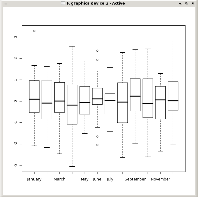
www.togaware.com/.../survivor/Grouping_Time.html
Box plot map consist of one or more box symbols that  summaries the data description within one or more seats. The values of a box plot is often calculated from data that is present in another series. This box plot show the data mining description in different months not in order.

Climograph map

https://blogger.googleusercontent.com/img/b/R29vZ2xl/AVvXsEjpJnFbItvX1v1YBIHHrz0OjeuxtLJ1aHktOsY6BaYNG0j03PHyKt0EOcmJPXqGYqrYvkX7Z_J_l4Crbl2oOcOf-Xi-QlG0ZAkY-9ctk2HheJOHfMjrVLWj9qlL6hto43MISxd0PZYtETD0/s320/climograph+map.jpg
 This Climograph map is used to show monthly average climate of an area in temperature plotted against precipitation. This map show Walgett, Australia tropical climate in months and temperatures against precipitation over the year. This map shows that over the month of January and  December, the temperatures rises as precipitation rise also.

Windrose map

http://originlab.com/www/products/images/new_graph_types_windrose.png
Wind rose map is used to show the relation of wind  direction to other weather conditions at a given location.This shows the direction of the wind marked by different colors to indicate the strength of the wind blow towards different directions.

Population profile

http://www.census.gov/history/img/TXpopprofile.jpg
Population profile map present graphic overview of demographic statistics collection of an area. This map show population census in Texas  in 2000. The dark blue color show more populated areas  while the white color show less population.

Index Value Plot

https://blogger.googleusercontent.com/img/b/R29vZ2xl/AVvXsEi4gjrCNPrPghCYWTqMRCgNRdrDwelFOJXEI9-gAkNJaOxhkfGJ3RaLm3rWmk3AxBNXf2Q6jVCye_EULWSAA-9jWUqZIQzYa_9-YxWrXiEPgg6Ado1SJrAzn5xVhI7AB6pffKfJtP46718/s320/index%25
Index Value plot shows the information that happen over time. This index value plot shows the average stream flow from 200-2008. The straight line show normal stream flow has been average with some ups and downs.
value%2Bplot.gif Index

Monday, March 21, 2011

Bilateral Graph

http://www.advancedbionics.com/cms/images/candidate/bilateral-graph-02-lg.gif
Bilateral graph is used to show more than two different variation. This graph shows the hearing percentage of right, left or both ears in noisy environment, and how each recognize word and sound in a given month.
b

Sunday, March 20, 2011

Cartograms map

politicalmaps.org
 Cartogram map  shows statistical information in an area. This map shows  presidential election results of 2008.Red and blue color are used to represent Republican voters and Democratic voters respectively according to different states votes.

Hypsometric Map

http://www.earthexplorer.com/2009-03/images/Figure-3---Topographic-hypsometric-map-of-Goiania-Metropolitan-Region_big..jpg
This is an hypsometric map showing the topographic hypsometric map of Goiania metropolitan region.This map is used in topographic survey of a map giving elevation by contours, or sometimes by means of shading, tinting or batching.

Histogram Map

http://www.originlab.com/www/resources/graph_gallery/images_galleries/Histo.gif
Histogram is used to show total distribution in the image and it helps in analyzing and correcting the contrast of the image.This Histogram show a histogram with normal distribution ovelay curve,it  display the number of times a data value in a selected column fell within a specific bin.

Correlation Matrix

http://www.livestockgenomics.csiro.au/Genome_to_Phenome/matrix_corr_gt1SD.png
Correlation matrix shows the strength and direction of a linear relationship between two random variables.Any statistical relationships between any given variables can be used on a correlation matrix. This shows the heat map of the tissues to tissue on a genetic basis.

Planimetric map

Planimetric map is used to show the horizontal position of planimetric features using images and symbols. This map shows Wayne country features of transportation and projects around the country.
ncdot.org

Monday, March 14, 2011

Thematic Maps

http://geodepot.statcan.ca/Diss/Maps/ThematicMaps/pop_dist_e.cfm
This Thematic Map shows the population changes in Canada from 1996-2001.This map is used to show the spatial distribution of one or more specific data themes for standard geographic areas.

Thursday, March 3, 2011

KLM Maps

www.gearthblog.com/images807/greecefire.jpc
This Image shows the KLM satelight of different parts of the world. It is important because someone can navigate and get locations even in the small world or a street side.
This